Emergency Care Waiting Times in Northern Ireland 2008-2017 and forecasting the future
 |
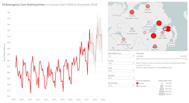
| Screenshot of the Tableau Dashboard. Available [here] and at the end of this post. |
[Note: the dashboard is
best viewed in Full Screen Mode (F11 or icon at bottom right)]
Having attended the rather excellent Open
Data Camp 5, held in Belfast over the weekend of 21-22 October 2017, I have
returned to OpenDataNI’s
datasets with renewed vigour and fervour. The first of these I’ve turned my
attention to is the recently published Emergency
Care Waiting Times dataset.
The Dataset
The dataset is just
over 2100 lines, representing monthly entries per Northern Irish hospital and
running from April 2008 to June 2017. The dataset gives the numbers of patients
who waited up to four hours, five to twelve hours, and over twelve hours. A further
column gives the total number of patients in these three categories. As noted, the
hospital name is given for each entry, and this is supplemented by the NHS
Trust they work under and the Type of Emergency Department (1-3) provided. A further column giving the Financial Year is
provided, but was not used.
Processing
The dataset didn’t require
a vast amount of procession. I split the MthAndYrCode column out into its
component parts for ease of use within Tableau. For the 23 current and former
hospitals, I manually added Postcodes and County information to another table.
The postcodes were converted to Latitude & Longitude, using doogal’s batch geocoding
service. Yep ... that was about it ... nothing too taxing!
The Vizualisation
The headline story in
the data is pretty simple, so I wanted to reflect that simplicity in my
approach to creating a dashboard, but still provide sufficient controls so the
user can drill down to find the information that’s most relevant and
interesting to them. Taking up the left hand side of the screen is a single
large line graph that plots the monthly data and attempts to provide a six
month forecast. I’ve deliberately broken the rule of including a zero point as
the original version of the graph confined itself to the top most part of the
page and didn’t allow for much in the way of seeing trends. Removing the need for
a zero point allows the graph to automatically adjust to fit the space
available and see trending more clearly. Users are advised to be aware of the
scale!
On the top right there
is a map of Northern Ireland with a dot per hospital. The dot is sized and
coloured by the number of patients waiting. As the smaller & lighter dots appeared
to blend into the map background, I gave each of them a black border to help
them stand out. Here the labels give the number of patients waiting and the
name of the hospital, as long as they don’t overlap. This works relatively well
for the majority of Northern Ireland, with the exception of the Belfast/Antrim
area where the number of hospitals means that several dots overlap. This is
exacerbated by the fact that, depending on the timeframe, the Royal Victoria
group of hospitals is represented under four different names. Again, caution is
advised in using the map as your sole guide!
Below the map are a
selection of filters to allow the user to drill down to the timeframe and
location of most interest and relevance to them. The Select Wait Time allows the user to examine the numbers of patients
waiting, either in the <4hrs, 5-12hrs, >12hrs, and All (i.e.
Combined) categories. Users can select the individual Northern Irish County, the relevant NHS Trust, or the specific Hospital for deeper levels of
granularity. The last dropdown filter allows the user to select between Type 1,
2, and 3 Emergency Departments to allow closer like-for-like comparisons. Although
the forecasting algorithm works best with the longest possible time series, I’ve
also added a double-ended callipers so specific time ranges can be inspected
too.
As always, clicking on
individual points (Ctrl+click for multiples) of the map or selecting parts of
the line graph will each re-filter and reconfigure the other graph. A
relatively new feature in Tableau is when the user hovers the mouse pointer over
the bottom left of the line graph a small minus (-) and plus (+) signs appear.
Clicking on the minus will re-aggregate the data down to the Quarter and Year
level, while clicking on the plus will bring the graph in the opposite
direction, towards finer and finer temporal resolution.
What does the Visualisation Show us?
When All waiting
categories are taken together, we can see that the numbers of patients waiting
are on the increase and are predicted to rise further. However, this is not the
full story. Just looking at the <4hrs category it is clear that while the
numbers had been falling through the period from 2008 to 2012 and remained
basically static through much of 2016, these are again increasing. More
worryingly, the numbers of patients waiting from 5-12hrs has risen dramatically
and is predicted to rise further. The numbers of patients waiting more than
12hrs, though suffering from regular massive spikes, is only slowly increasing.
These are stories repeated in different ways and with different emphases
throughout the dataset when it broken down in different ways, be it by County,
Trust, or individual Hospital.
The true power of an
interactive visualisation like this is that you, the user, do not have to unquestioningly
accept the narrative I present. For example, if your interest in the NHS is at
the Northern Ireland level, my narrative above may be of relevance. However, if
you live in Fermanagh and you are only interested in the affairs of the South
West Acute. For example, you may be keen to examine why a service that had very
few patients waiting over 12hrs before December 2015 suddenly appears to have
been overwhelmed in the period after this, with a massive spike of 74 patients
in January 2017, but calming down thereafter. A similar story can be seen in
the 5-12hrs waiting time where the number of patients rapidly increased from
around November 2015, peaking at 925 in December 2016, but falling off in the
period since. The truth is that every individual Hospital, Trust, and Service
Type have their own stories to tell. However, writing them out individually
would be vastly time consuming for me and not particularly interesting for the general
reader. Instead the dashboard provides the tools to drill into the data and
find the stories that are of most relevance and interest to you.
What are you waiting
for? Go search!
If there are issues
with this embedded version, try the dashboard on my Tableau Public page [here].
Best viewed in Full Screen Mode


Comments
Post a Comment