Terrorism in Europe 1867-2017. Initial Experiments with the Data
 |
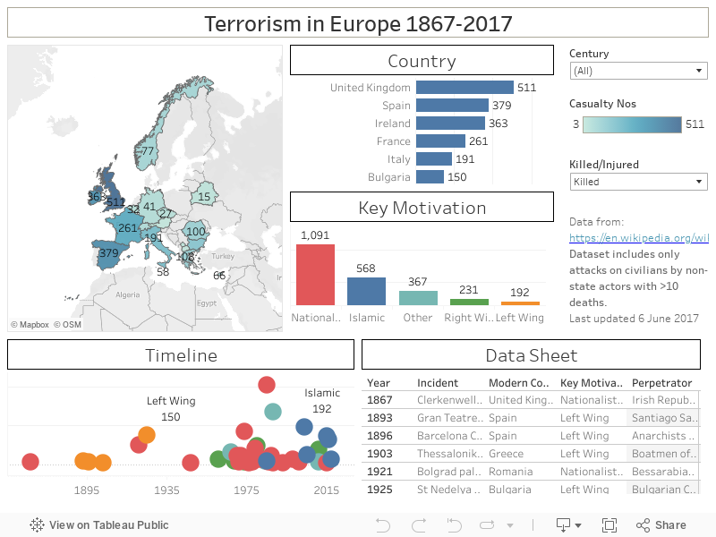
| Screenshot of the Tableau Dashboard. Available [here] and at the end of this post. |
In the aftermath of the attacks at the Manchester Arena in May 2017 and at London Bridge the following month, I felt that I wanted to take a closer look at data relating to terrorist attacks across Europe. At a purely personal level, my hope was to discern patterns and provide a broader context for my own understanding. In searching for a suitable data asset, I encountered the Terrorism in Europe Wikipedia page. The data doesn’t attempt to cover every incident, limiting itself to those where 10 or more people (including the perpetrators) died. It also consciously defines actions by State actors as beyond the definition of terrorism – a nuance lost on some critics of both the dashboard and the underlying data.
The Data
One chief attraction
from the point of view of creating a visualisation is that the data in the Wiki
article was relatively clean and needed relatively little tweaking to make
serviceable. I’m always nervous about dates in Tableau, so I spent some time
breaking the Wiki format of Day, Three letter month, Year out into separate
columns to be recombined using the MAKEDATE() function. The Country/Region was
relatively straightforward with the exception that Tableau doesn’t recognise
older geographical units such as the Ottoman Empire and Czechoslovakia. These I
simply converted to their nearest modern equivalents. As the former was the Thessaloniki
bombings of 1903, it was changed to Greece, while the latter was changed to the
Czech Republic. As Tableau only recognises the UK (as it currently stands) as a
single entity, the constituent nations and province were grouped together. In
the Wiki source the Casualties data is quite messy, being presented as a free
text line of both killed and injured, along with the sources to back up the
figures. Here I manually split this data into two separate columns of Killed
and Injured. Where figures are given as minima (e.g. 20+) this bottom line figure is used. In all cases the
perpetrators, ‘Hoist with his own petard’, are excluded from the dataset. The
columns for Incident and Perpetrator are unchanged from the original. The data
on the Wiki page is colour-coded by a high-level designation of motivation (Nationalist/Separatist,
Islamist, Right-wing, Left-wing, and Other). I manually added this as a final
data column. As the dataset relies on modern country names rather than specific
towns and cities, there was no need for any elaborate geocoding – this would
all be taken care of by Tableau. The most recent events in the dataset are the
attacks in the UK noted above, stretching back to the Clerkenwell
explosion of 1867, carried out by the Irish
Republican Brotherhood.
The Dashboard
The map on the top left
gives an impression of where has suffered most – the darker the colour, the
higher the number of casualties. I’ve gone for a bluey colour over something
more emotive, like red. While it has the advantage of immediacy, it lacks the
ease of comparison – even showing the totals. The top right bar chart ranks
countries by casualties, allowing easy state to state comparison. Below this,
the data is broken out by Key Motivation, while on the bottom left I provide a
time line by year of attacks, broken out by motivation, where the number of
casualties determines the position on the Y-axis. The final portion of the
dashboard is a Data Sheet, listing all the incidents, countries, motivations,
perpetrators, and casualties by year.
The top right corner
holds just two controls that allow the user to filter the dataset by century
and the casualties. In the latter case, I use a parameter to display either the
Killed or Injured, or a Combined figure of both. As always, clicking on any
single element on any one of the graphs (Ctrl+[click] for multiples) refilters
the entire dashboard to reflect those choices.
What do we learn?
Just looking at deaths
in the dataset, it is clear that the UK has suffered the most (511), with Spain
in second position (379). Of the UK number, 270 of those deaths are related to
the Lockerbie bombing,
with 160 relating to Nationalist/Separatist activity, and 81 from Islamic
terrorists. The latter come from the two attacks mentioned previously –
Manchester and London – while the Nationalist/Separatist attacks were almost
exclusively by Irish Republican terrorists. The only exception to this was the
UVF’s bombing of
McGurk’s Bar in 1971, which left 15 dead.
With the exception of Anders Behring
Breivik’s attack in 2011, all Right Wing attacks fall in the period from
1961-1980 and together claimed 231 lives. By contrast, attacks carried out by
Left Wing terrorists claimed 192 lives and were confined to the period from
1893-1925. Looking across Europe, it is clear that the majority of incidents of
all motivations are from the period after 1960. There can be no doubt that
Islamic terrorism is increasing in frequency and has claimed 568 lives with a
further 4,303 wounded in the selected attacks. When all casualties are
combined, Islamic terrorism has killed or injured slightly fewer people than
all other groups combined. Purely in terms of people killed, the largest amount
can be ascribed to Nationalist/Separatist related terrorism (1091).
The dataset has the
advantage of an historical aspect, allowing comparisons back into the late 19th
century. However, the restriction to attacks with more than ten deaths masks
much of the reality of terrorism. By this I mean that the true impacts of terrorism
are not measured in the headline body counts, but in their pervasiveness within
society – an attack that fails to injure a single person can be a
psychologically damaging to a person’s feeling of safety as one that claims
lives. Similarly, a sole focus on Europe prevents broader comparisons and an
understanding of the global context. Although the dashboards accurately reflects
the underlying data, and there is much scope for delving and drilling into that
data, it remains unsatisfying as I am continually drawn to thoughts of what has
been overlooked.
If there are issues with this embedded version, try the dashboard on my Tableau Public page [here]

Comments
Post a Comment